LuxMan
Designing an attractive website for a private barbering studio.

Overview
LuxMan is a small private barbering studio in Tauranga, New Zealand. Having persisted with the same rudimentary design since opening its doors, LuxMan was overdue for a website re-design.
As the business evolved within its first year, introducing new services and offerings, it became evident that the website needed to reflect these changes. We decided to create a digital presence that reflected LuxMan's values - high quality, affordable barbering in a friendly and relaxed environment.
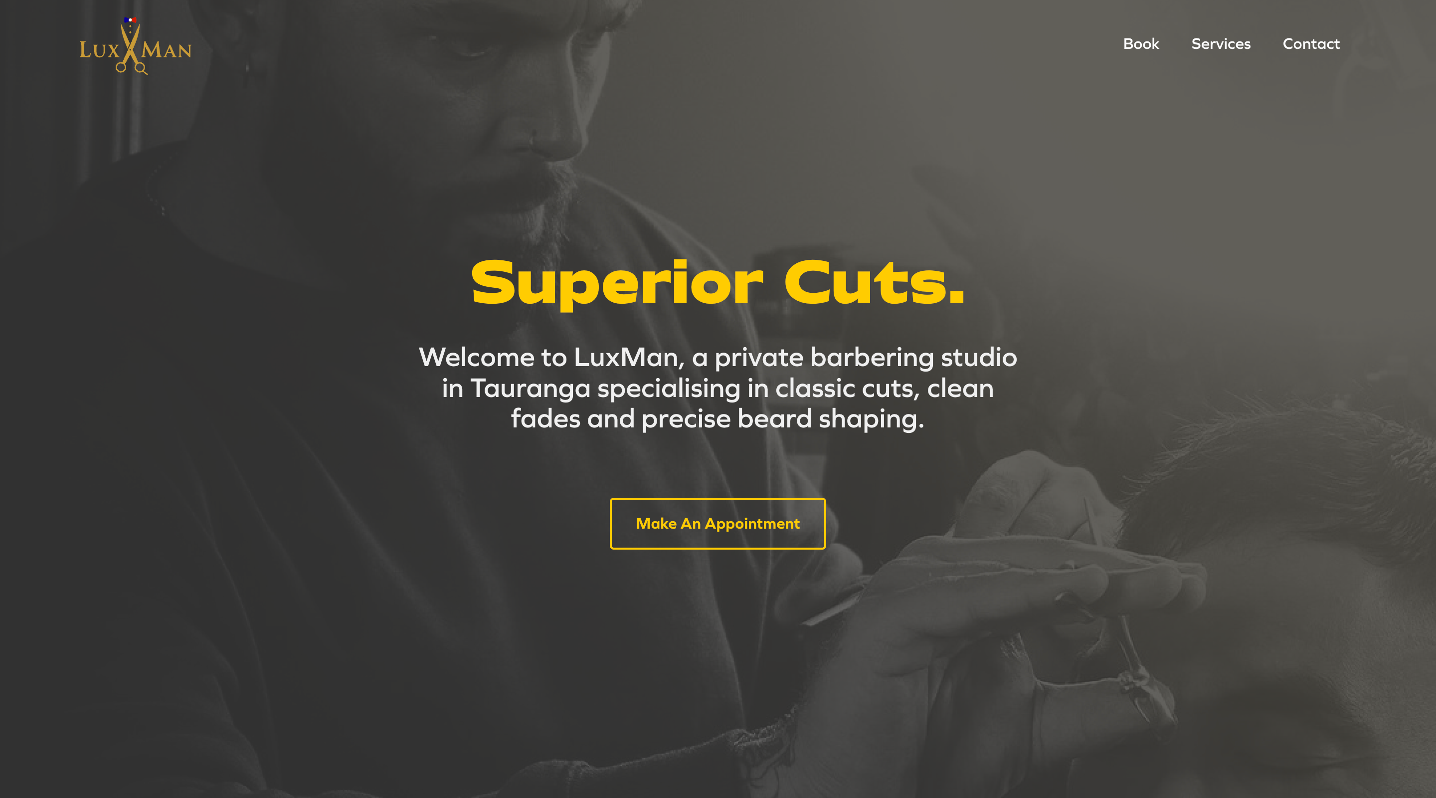
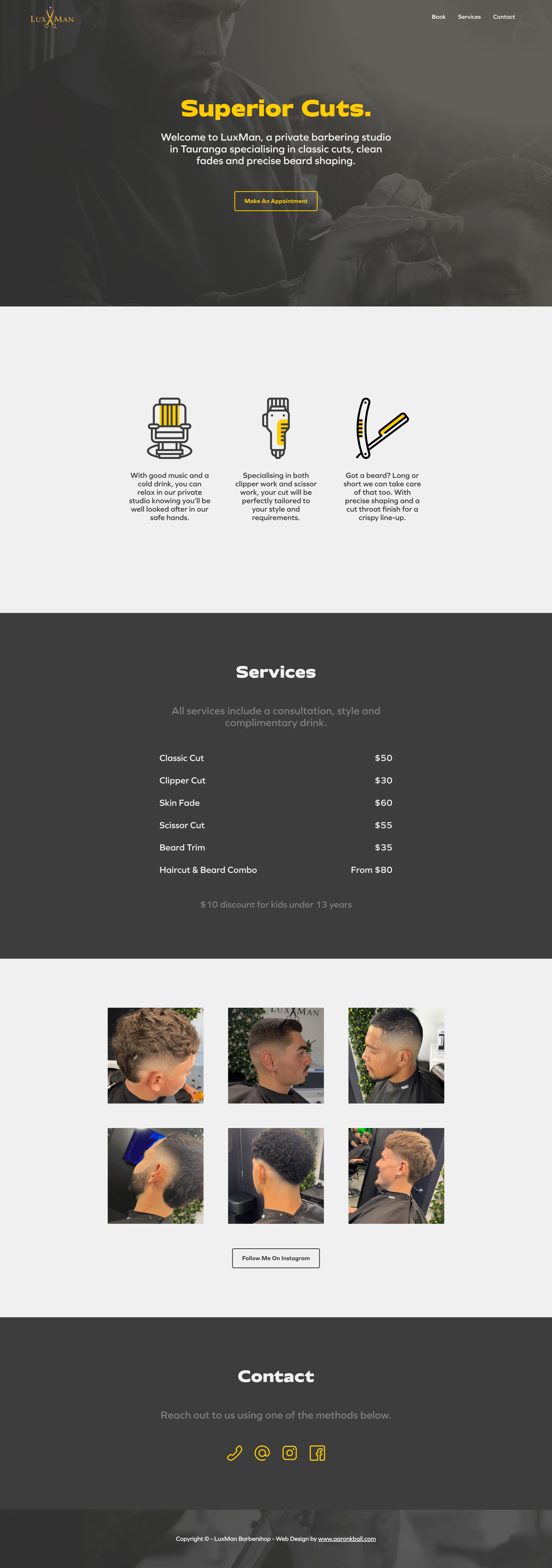
I inspected the original website to find a lack of cohesion – from its absence of a defined colour palette and inconsistent fonts to unpolished imagery, and decided to counter each of these. I opted for a dark grey and yellow-gold colour scheme, hoping to instil a sense of both craftsmanship and masculinity throughout the website. I also applied consistent and hierarchical text, ensuring effortless navigation for users to access the information they seek. To enhance user experience, I integrated a streamlined booking service for LuxMan, alongside providing additional contact options for user convenience.You can view the design here: www.luxmanprivatebarber.com.
