MRIme


How might we streamline brain health investigation for sports physicians?
Existing approaches to monitoring athlete brain health are inadequate and a lack of standardised protocols has lead to reactive rather than preventive procedures. There is a need for data-driven software that enables standardised assessments and empowers sports physicians to safeguard athlete brain health.
Discovery
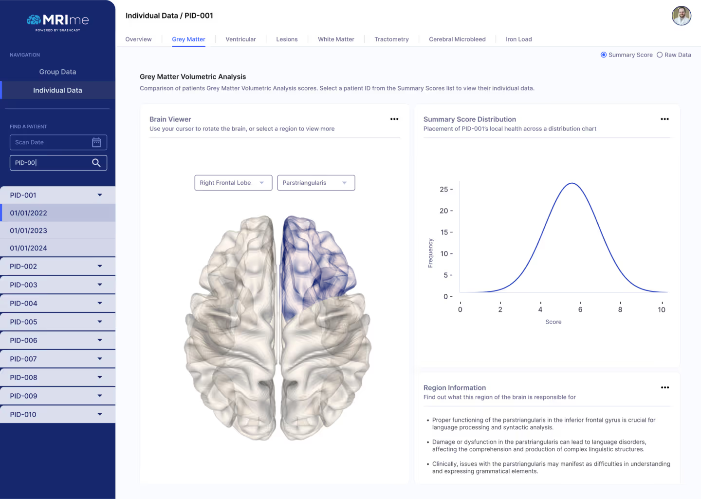
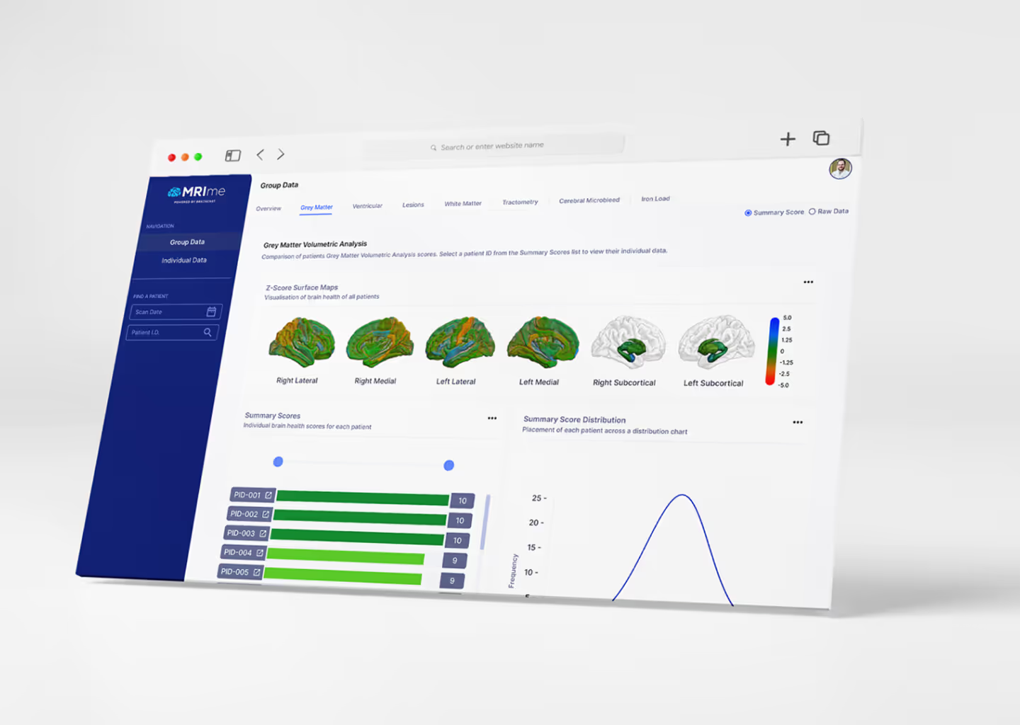
BrainCast / MRIme had developed algorithms that pull raw data from MRI scans to show important measures of brain health, aiding sports physicians in both tracking and preventing brain damage for their athletes. We needed to find a way to take this raw data and make it easy to view, understand, and compare alongside past and future datasets.
We started by leveraging the company’s network to assemble a consultation group of sports professionals, which included general managers, physicians, athletes, and CEOs from AFL and A-League clubs in Melbourne.
Through surveys and individual user interviews with our consultation group, we were able to find answers to questions about current protocols and challenges involved in tracking athlete brain health and making accurate diagnoses. Some of our discovery during this stage included:
- While the product would be primarily built for and used by doctors, there was a significant need for the data to be easily digested by both athletes and club admins, this would require simplification within some of the data-heavy areas of the app.
- When players fell below the average health line, we needed it to be clear. Users should be able to open the app, and see which of their players are of concern within just a few clicks.
- We could save time and effort for users by displaying the collective well-being of teams. In the event that the whole team was healthy, there would be little else for the user to do, so we should consider giving the collective well-being the prime real estate of the app.
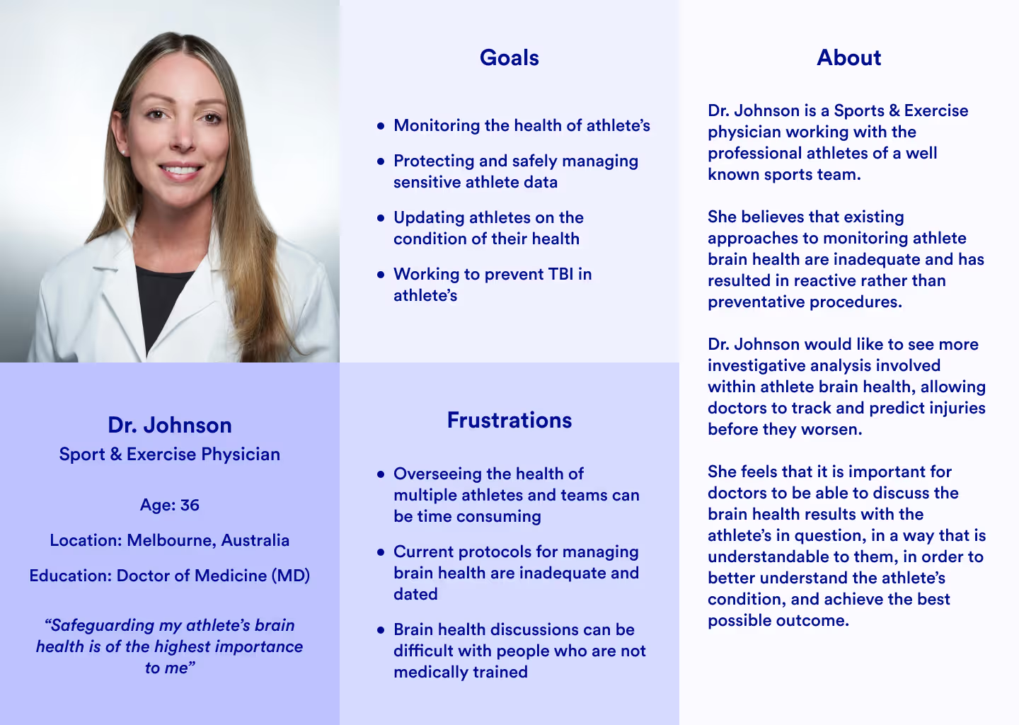
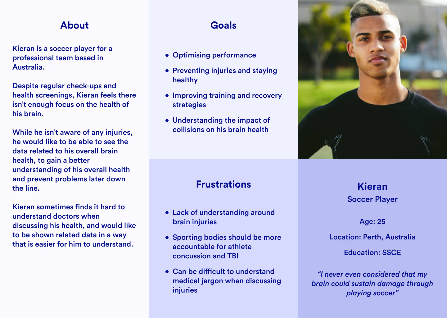
In addition to the above findings, we synthesised some common answers from the surveys and interviews to help put together some user personas, these helped us keep our intended users front and center while progressing through the following stages.
Ideation
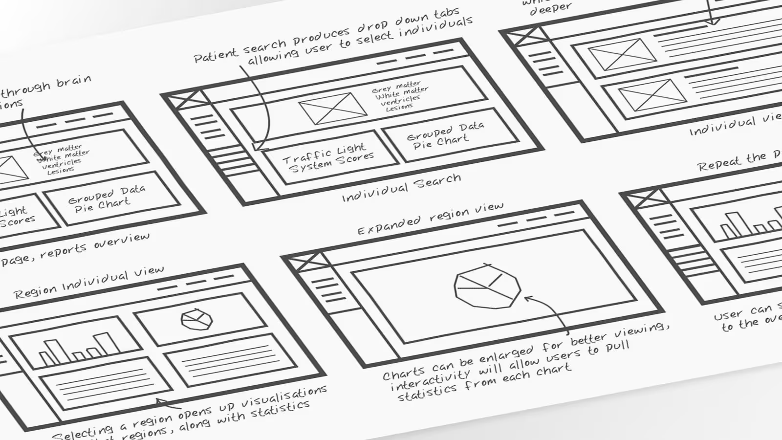
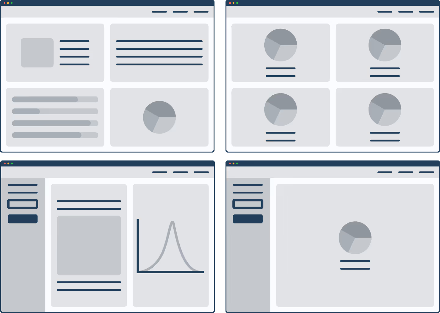
Using our interview data and user personas as guides, we did some rapid wireframing to create the structure and functionality of MRIme. We used this stage to piece together ideas that helped solve the user frustration points, as well as taking advantage of the low fidelity frames to quickly work out an optimal navigational flow.
We then worked on the layout to ensure we had strong placement for the Player Search function, as well as considering fluidity to allow the platform to scale along with increased datasets. We researched and compared several medical apps to inspire the layout of MRIme, ensuring our design respected industry norms.
We then worked on the layout to ensure we had strong placement for the Player Search function, as well as considering fluidity to allow the platform to scale along with increased datasets. We researched and compared several medical apps to inspire the layout of MRIme, ensuring our design respected industry norms.
Testing
Taking what worked from our low-fidelity wireframes, we created a working prototype in Figma to test with our consultation group. The resulting prototype was somewhat of a 'frankenstein' due to throwing in as much as we could, this deliberate strategy aided us in identifying the most effective concepts, helping us avoid potentially costly development errors and affording us the opportunity to refine the prototype before proceeding with the development phase.
In addition to some changes we were already aware of, including some colour and accessibility refinements, user testing helped us recognised the need for a few more additions and changes:
- The initial tab section was confined to one panel, and as future functionality would also mean additional tabs, we needed them to have better placement allowing for scalability.
- We needed some form of help dialogue to be accessible through each component, in the event that a user was unsure what information they were viewing, we could not leave room for error.
- The athlete search bar could be slimmed down, allowing more screen area for components.
- We can not store any athlete names, birth dates or other identifying data within the app, so it would be necessary to find a way for the user to link the data to each athlete offline.
Prototyping
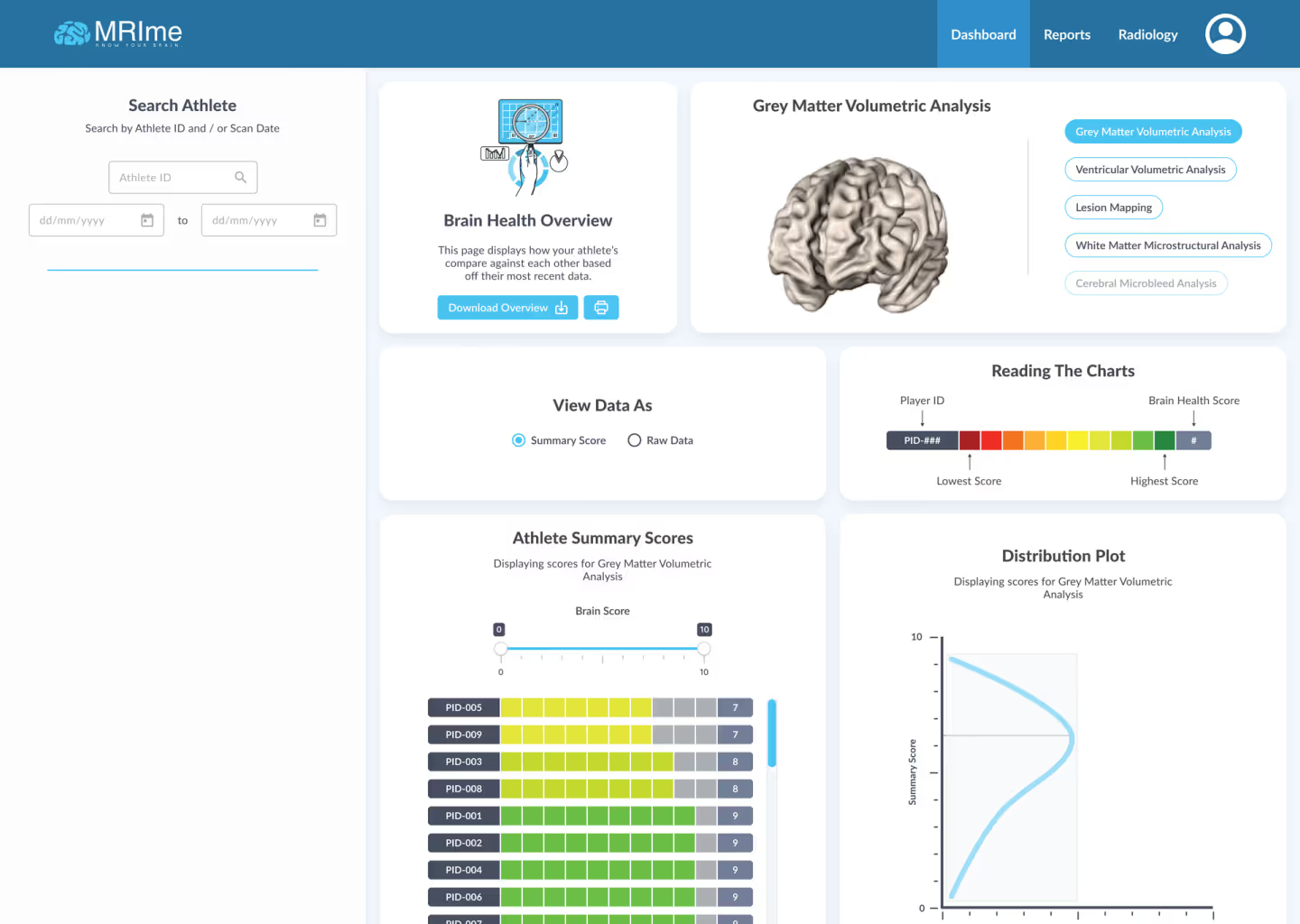
Once our initial testing was complete, we started to work on a sleeker and more refined design, while implementing the necessary changes. We created a design system to define the guidelines for type, colour and spacing, as well as creating components to be reused throughout the app pages and allow for quick scalability.
We then released the early prototype to a small amount of sports physicians with a feedback questionnaire, we were able to find that all physicians were able to operate the software smoothly, could see themselves using the product in the future, and had largely positive feedback regarding the overall experience.
We then released the early prototype to a small amount of sports physicians with a feedback questionnaire, we were able to find that all physicians were able to operate the software smoothly, could see themselves using the product in the future, and had largely positive feedback regarding the overall experience.
What did we achieve?
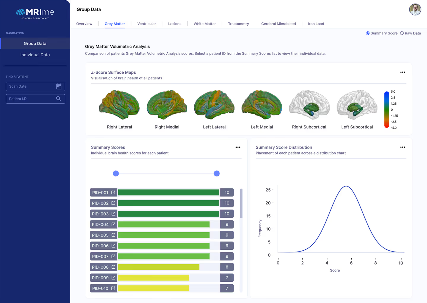
Club physicians can now gain immediate access to a comprehensive overview of all their patients within a specific team. After opening the app they can immediately see which of their patients are sitting below the average in brain health, before navigating directly to the individuals athlete to explore brain regions and data.
MRIme helped secure more venture capital for the company and is now being used by sports teams across the AFL, A-League and EPL to protect their athletes from TBI.
MRIme helped secure more venture capital for the company and is now being used by sports teams across the AFL, A-League and EPL to protect their athletes from TBI.
