Overview
Beau Beauty is an independent salon with over 30 years of combined experience across aesthetics, skincare, and beauty treatments. They came to me with no brand identity and no online presence, just a loyal local client base built entirely through word of mouth. The brief was to create everything from scratch: a logo, print materials, and a website that would bring in new clients from search.
01 — Brand Identity
The salon wanted to feel premium without being intimidating. I developed a visual identity built around a deep navy and champagne gold palette: dark enough to feel luxurious, warm enough to feel welcoming. The logo uses a custom script wordmark with a subtle heart detail, giving it personality without relying on generic beauty iconography.
This visual language carried across all touchpoints. Business cards used the navy as a base with gold foil for the logo. The printed price list followed the same hierarchy: clean, scannable, and consistent with how the brand looks online. Everything was designed as a system so the salon could extend it themselves as they added new services.
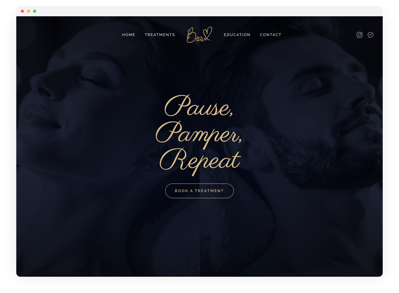
02 — Website
The website had one job: turn visitors into bookings. The hero section leads with "Pause, Pamper, Repeat" over a full-bleed treatment image, with a prominent "Book a Treatment" call-to-action above the fold. Navigation is minimal (Home, Treatments, Education, Contact) because those are the only four things a potential client is looking for.
The biggest design challenge was the price list. Beau Beauty offers dozens of treatments across multiple categories (facials, injectables, skin treatments, lashes, waxing). Presenting all of that on a single page, especially on mobile, would have been overwhelming. I built an accordion-style layout that groups treatments by category, so visitors can scan the menu quickly and expand only what they're interested in. Each treatment includes a short description, duration, and price, giving people enough information to book without needing to call.
03 — SEO & Performance
For a local salon, search ranking is everything. I structured the site with local SEO in mind from the start: clean semantic markup, fast load times, optimised images, and location-specific content throughout. The treatments page doubles as a keyword-rich landing page for each service category, which meant the site was competing for dozens of search terms rather than just "beauty salon near me."
Within a few months the site reached #1 on Google for "Aesthetics" in the local area and top 5 for "Beauty Salons", driving a consistent stream of new bookings each week without any paid advertising.
04 — Design System
Every element of the Beau Beauty brand follows a consistent design system, from the script typography and navy-gold palette through to button styles and spacing. This system ensures the brand feels cohesive across web, print, and social.
Typography
Pause, Pamper, Repeat
Elegant script for hero headings, the logo wordmark, and key brand moments. Evokes warmth and luxury.
Montserrat
Clean, geometric sans-serif for navigation, body copy, and UI elements. All-caps tracking for nav links.
Colour Palette
Buttons & CTAs
Gold outline · Gold text · All-caps tracking · On dark background
Navy outline · Navy text · All-caps tracking · On light background
Spacing
Brand Elements
Results
6/week
New client bookings directly from the website
90%
Client rebooking rate after first visit
#1 Google
Top ranking for 'Aesthetics' in local search
#4 Google
Top 5 ranking for 'Beauty Salons' in the area